Statistics
“Numbers. They’re not always what they seem.”

Lies dam lies & statistics
We live in a world driven by statistics, sadly very few people under stand how they work (or can be worked)
Graphs and statistics should help summarize data. But they are also often used to lead people to make incorrect conclusions & not many people are willing to admit they don’t understand the figures …so it’ a conman’s charter.
Lying with Statistics: https://www.youtube.com/watch?v=r7LNAnax2og – 2 mins – Excellent.
See also
The misapplication of statistics in everyday life – https://www.youtube.com/watch?v=8Iz_cjaeao4 -57mins
Mainly medical examples, but the principles are common across the board.(the last 4 mins is important !! )
& a wonderful little book, “How to Lie with Statistics”, Here’s a .pdf link for it:
http://www.horace.org/blog/wp-content/uploads/2012/05/How-to-Lie-With-Statistics-1954-Huff.pdf
If you flip a group of 8 coins once and they come up all heads, that’s very unusual. But if you throw the same group of 8 coins a hundred times, somewhere in there you’ll likely come up with eight heads.
how unusual something is depends on how many places you’ve looked for it. If you look long enough for even the rarest relationship, you’ll likely find it … but that does not mean that the find is statistically significant.
See: The Bonferroni correction http://mathworld.wolfram.com/BonferroniCorrection.html
Cheating Charts
Here’s a really panicky chart from NOAA:

Here’s a slightly different version of that same chart:
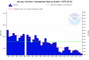
You can’t argue with those figures : That slope shows a massive loss of sea ice, so we need to panic…. NOW… therefore you must –
Pay more ‘green’ taxes & Obey your politicians, for only they can save us from total destruction !!!
BUT
here’s what the situation really looks like with the proper scale on the y-axis:
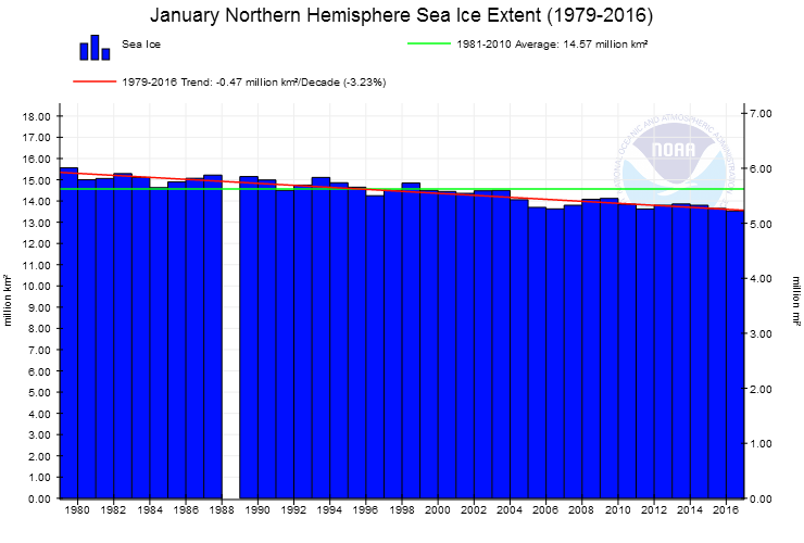
Oh…Panic over… There’s plenty of ice.
Sticking with Arctic Charts; here’s another trick you can do…move the start point –
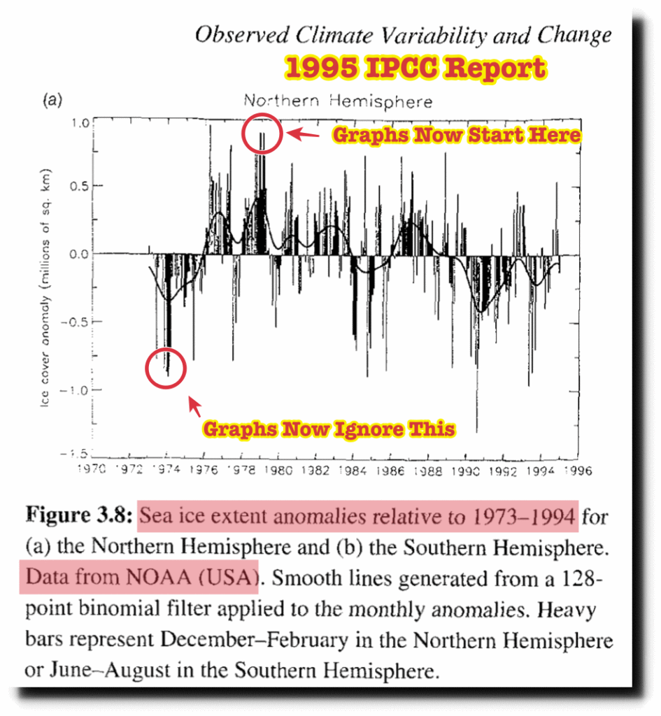
and you can turn a rise into a fall. Simples. See more
This video shows some of the many ways people can be misled with statistics and graphs.
Don’t believe everything you read ! – https://www.youtube.com/watch?v=OQkNU4woTZg -13 mins.
See also ‘Misleading Graphs’ – https://www.youtube.com/watch?v=GEsjMbTPiZM -10 mins
& https://www.youtube.com/watch?v=fvKdYUCUca8 start at 29min to 39min
Slippery stats
A good statistician can conjure any result you want from any data – by simple cherry picking.
Example:
Just before a meal you feel hungry, after a meal you feel stuffed full.
Suppose you breakfast at 8.15, lunch at 13.15, evening meal at 19.15.
If I record your feelings every half hr – the plot will show you are fit, well nourished & content….average.
But:
If I record your feelings at 8.00, 13.00, & 19.00 – the plot will show you are constantly hungry –
You could be Anorexic, have worms or cholera !!
Or:
If I record your feelings at 8.30, 13.30, & 19.30 – the plot will show you are constantly full –
You could be Morbidly obese with all the breathing, heart, liver, kidney & mobility problems !!
So which outcome would you LIKE to show ? The statistics can prove they’re all ‘true’.
First rule of dealing with statistics: always ask who’s paying for the study.
Some Examples of Misleading Statistics –
Misleading Graphs: Real Life Examples
We see false data in advertising every day but hardly anyone questions it !
Unless we have good access to the data and know how is was obtained, we should always recognize that statistics can misrepresent what is going on. If we get our information from a group that has a strong political or philosophical agenda, we can almost take for granted that their statistics (as well as the rest of their arguments) have been carefully chosen to promote their point of view. http://www.truthpizza.org/logic/stats.htm
& always remember …Statistically, if only 1 out of 7 dwarfs is happy,
then 86% of dwarfs could be miserable.